COCOAFAIR CHOCOLATE
BRANDING AND PACKAGING DESIGN
CLIENT: COCOAFAIR Chocolate
COCOAFAIR is a small Cape Town based chocolatier that makes chocolate in small batches, following the tree-to-bar process. They source quality fine organic cacao beans directly from small scale farmers in the northern part of Panama close to Bocas, bring it to South Africa and make chocolate.
The task was to first refresh the corporate identity of COCOAFAIR, and then kick of the rebrand with their popular 100g chocolate bar range. The redesigning of their other products followed suit.

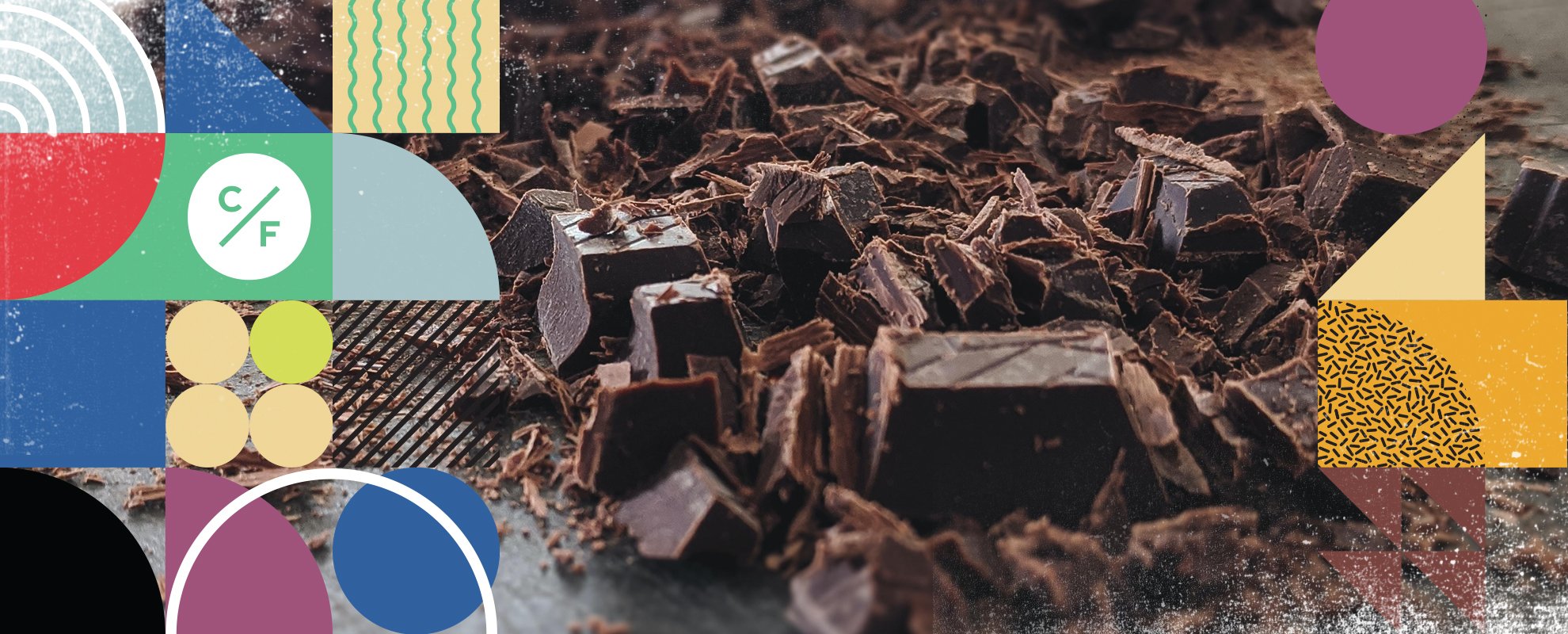
The new corporate identity was a simplification from the previous identity and is a very simple word mark that has longevity. The basic geometric shapes are represented in the COCOAFAIR word mark. This, together with key concepts the rebrand should capture, inspired the visual language.


The visual language is colourful and consists of geometry, textures, forms and structure. These become the elements to ensemble together to create the various interpretations of the products and flavours.


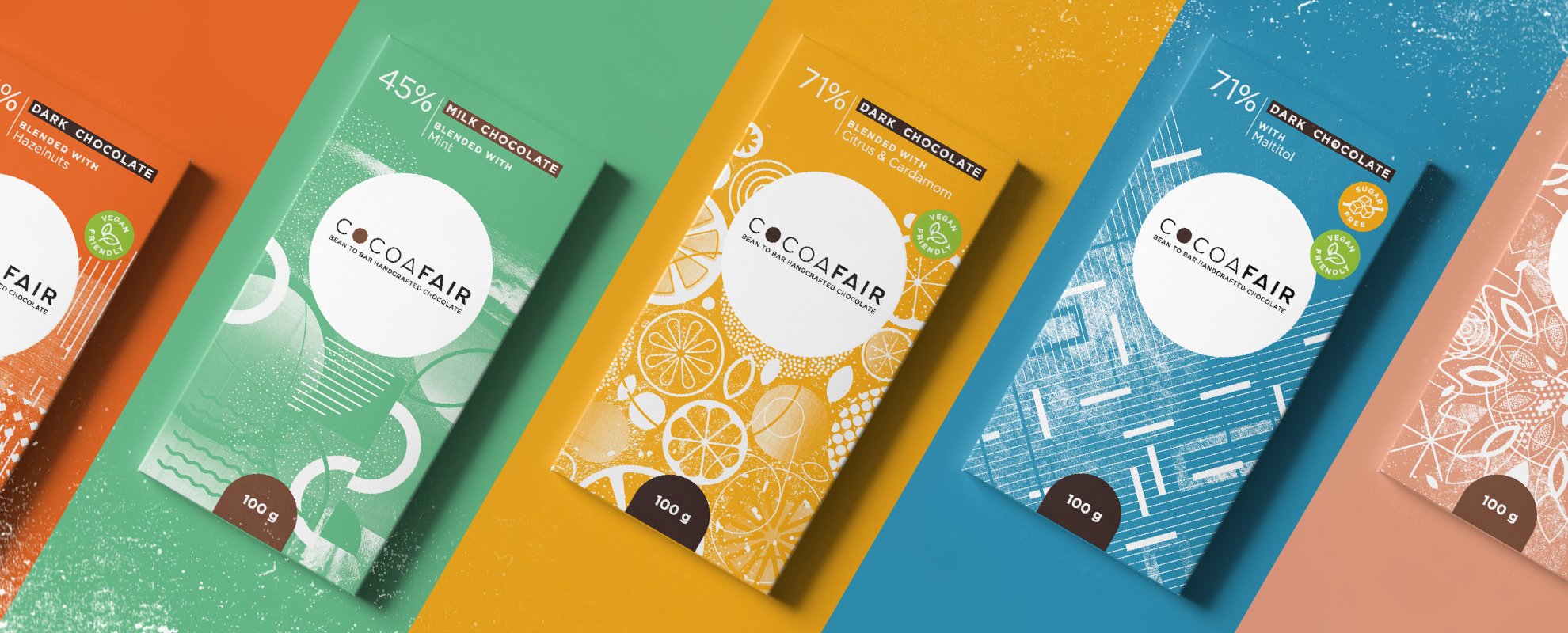
Vibrant and playful illustrations for each of the COCOAFAIR chocolate bar flavours were crafted making use of digital and traditional media mark making. These illustrations were developed in the same established visual language, yet each illustration aspired to capture a characteristic of the flavour it represents, making each interpretation unique and easily recognisable. The flavours were also assigned a colour each that assisted with the representation of the flavour and the differentiation between flavours.
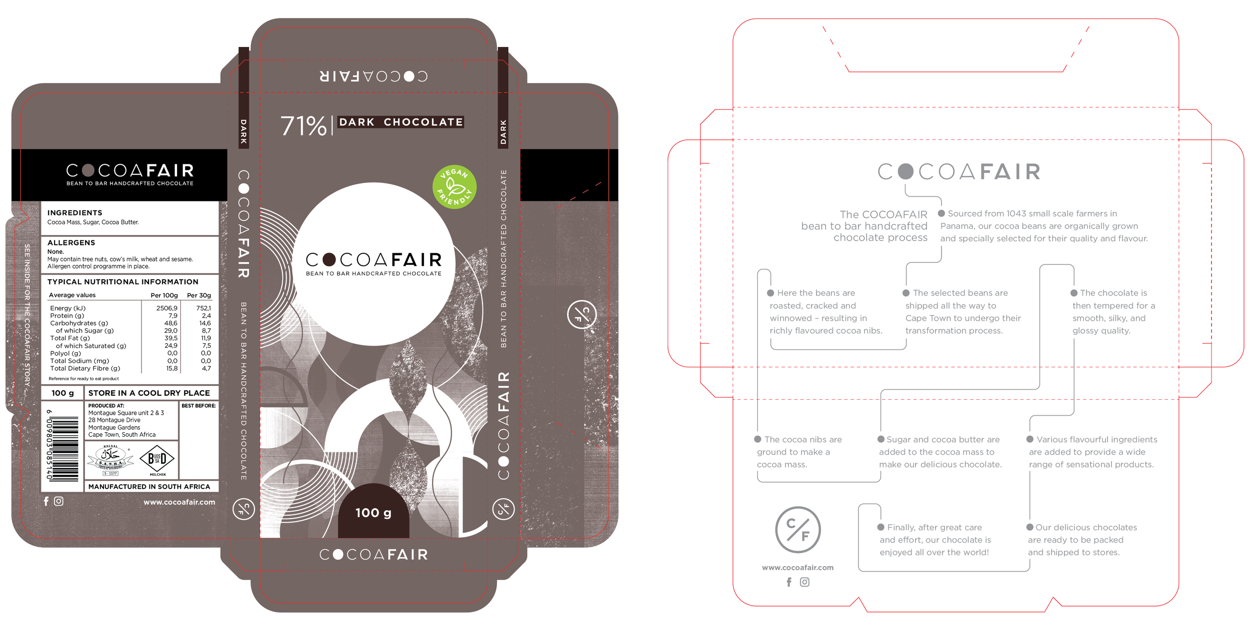
An easy to open packaging die-line was chosen for the new look of the COCOAFAIR chocolate bars. As the illustrations bring a complexity and dynamic to the design, it was decided to keep the rest of the colour palette quite simple. This made it easy to differentiate between the flavours and keep a balance in the design.


The COCOAFAIR 100g chocolate bar range was developed keeping with each’s unique colour palette to make the products easily identifiable. Each illustration was uniquely created to represent the flavour of the particular bar, in line with the visual language and design assets developed.
The result is vibrant, dynamic, playful, energetic, modern and uniquely identifiable. Each design is hugely different, yet there is a strong sense of unity in the range.