
STELLENBOSCH TRIENNALE 2020
EVENT THEME IDENTITY AND BRANDING
CLIENT: Stellenbosch Triennale
The year 2020 saw the very first Stellenbosch Triennale, a contemporary art exhibition featuring the finest art from Africa for the world. The inaugural Triennale consisted of a series of art exhibitions, performance art, a film and music festival, public talks and an educational programme.
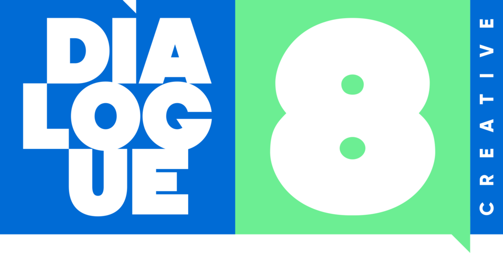
The brief from the client was to conceptualise, develop and design a visual identity for the 2020 theme “Tomorrow there will be more of us” set out by the Chief Curator, Khanyisile Mbongwa. The scope of the project included a logo for the event, a visual language that can communicate throughout the various branding elements, design assets such as print and digital communication material, signage, outdoor awareness elements and a concept design for the catalogue document.
The campaign was awarded a Finalist at the 2020 Loeries Awards, in the category: Brand Identity and Collateral Design - Identity Programmes.


The logo was transformed into a vessel for carrying the visual language, thus becoming a logo system, where the artwork that was masked in the logo mark could be adjusted, moved, removed or changed. This application echoes the further use of the visual language in the various communication materials.
In order to visually capture the concepts of time, movement, flux and change that are great attributes to the brand and theme, the word mark was constructed to be adaptable and adjustable. This construction creates a dynamic system that can adapt to the various formats of the media, and become an adjustable element that contributes to the harmonious composition of various design components and information.

Concept and process were extremely important aspects to represent the brand. The visual language had to be well considered, and had to have meaning. Therefore, the visual language was generated through the combination of various different aspects and processes, traditional and digital, linking back to the conceptual meaning it brings and also visually representing the Chief Curator’s theme for the event; a new togetherness.


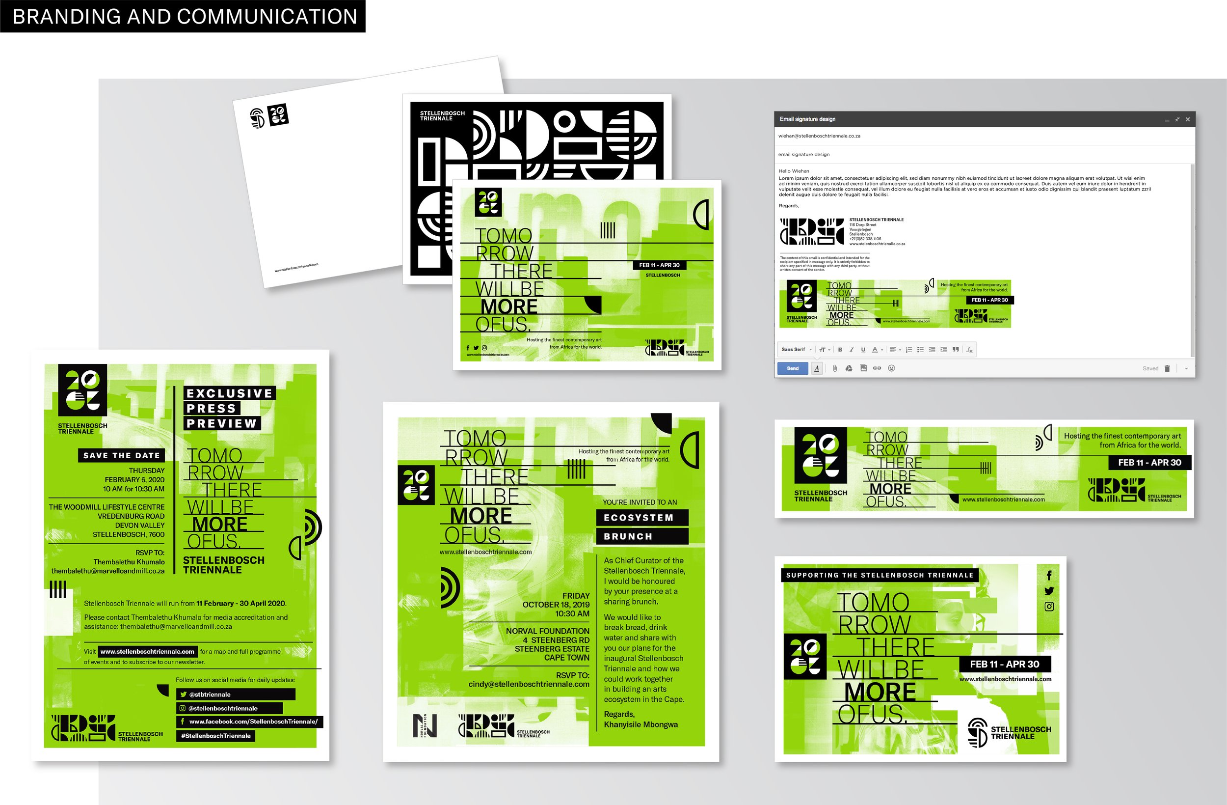
Various communication items were developed to advertise and create awareness for the event. These items included, but were not limited to, email and online banners, as well as digital and printed invitations.

It was necessary to develop certain wayfinding elements to ease communication regarding venues, types of events and to provide direction. A set of numbers were designed in the 2020 theme look and feel that was primarily used to label the various exhibition spaces. A set of universally recognised icons were also developed in the 2020 theme look and feel to communicate specific types of events, spaces, and directions. Furthermore, these numbers and icons were used throughout various communication materials to assist with wayfinding and signage.


Due to the event being held at different venues throughout Stellenbosch, various types of signage and wayfinding elements were required to assist visitors in finding the exhibitions and other places of interest. These types of signage systems included directional signs, indicators to the particular venues such as totems at the entrances, and information signs and boards to communicate detail regarding the particular exhibition.

Throughout Stellenbosch, various branding elements were required to transform the town into green and black in celebration of the event. These items included flags, posters, pole ads, vinyl window stickers for businesses that supported the event, and graffiti stencils with eco-friendly chalk-based spray paint to paint the town green.


Like any international arts event of this scale, the 2020 Stellenbosch Triennale required a substantial catalogue as a souvenir to capture the story and theme for 2020, showcase the artists and their work, and provide articles and writings from various intellectuals and influencers.


